

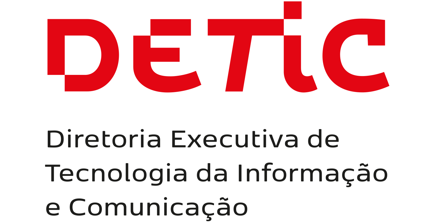


Designed letter by letter exclusively for its visual identity, the DETIC logo references the drive for digital transformation, inserting into the letters the idea of the _pixel_ mesh, the small dots that form the screens through which we have access to a universe of services and information.
The tilt of the letter T reinforces our commitment to boosting various sectors of the University with the support of technology.
These simple details allow the logo to have its own personality, without drawing too much attention to itself when used in conjunction with the Unicamp brand.
Versions
The logo is available in three versions:
– in red (preferred application)

– in black (application on light backgrounds)

– blank (application on dark backgrounds)

Rules of use
To learn how to correctly use the DETIC logo, see the Visual Identity Reference Guide.